
Radoslav Milev
Usability Specialist
Did you like our case study?
If you found value in our case study and are seeking similar outcomes for your own projects, we invite you to collaborate with us. We are dedicated to delivering innovative solutions tailored to your specific needs and objectives.
North Star Metric
The "North Star" concept comes from the idea of using a guiding principle to steer a ship in the right direction. Similarly, the North Star in this project was the Task Success Rate.
Task Success Rate
Task success rate and conversion rate are closely related in the world of online commerce. When users seamlessly accomplish objectives on your website — be it seeking information, completing forms, or making purchases — they are significantly more inclined towards conversion.
Task Goal
The goal for our case would be Creating an Account (Apple ID):
Users register for an account to make future purchases, save addresses, and track order history.
You can find the Task Success Rate analysis here...
Stage 3
Task Success Rate as
UX North Star metric
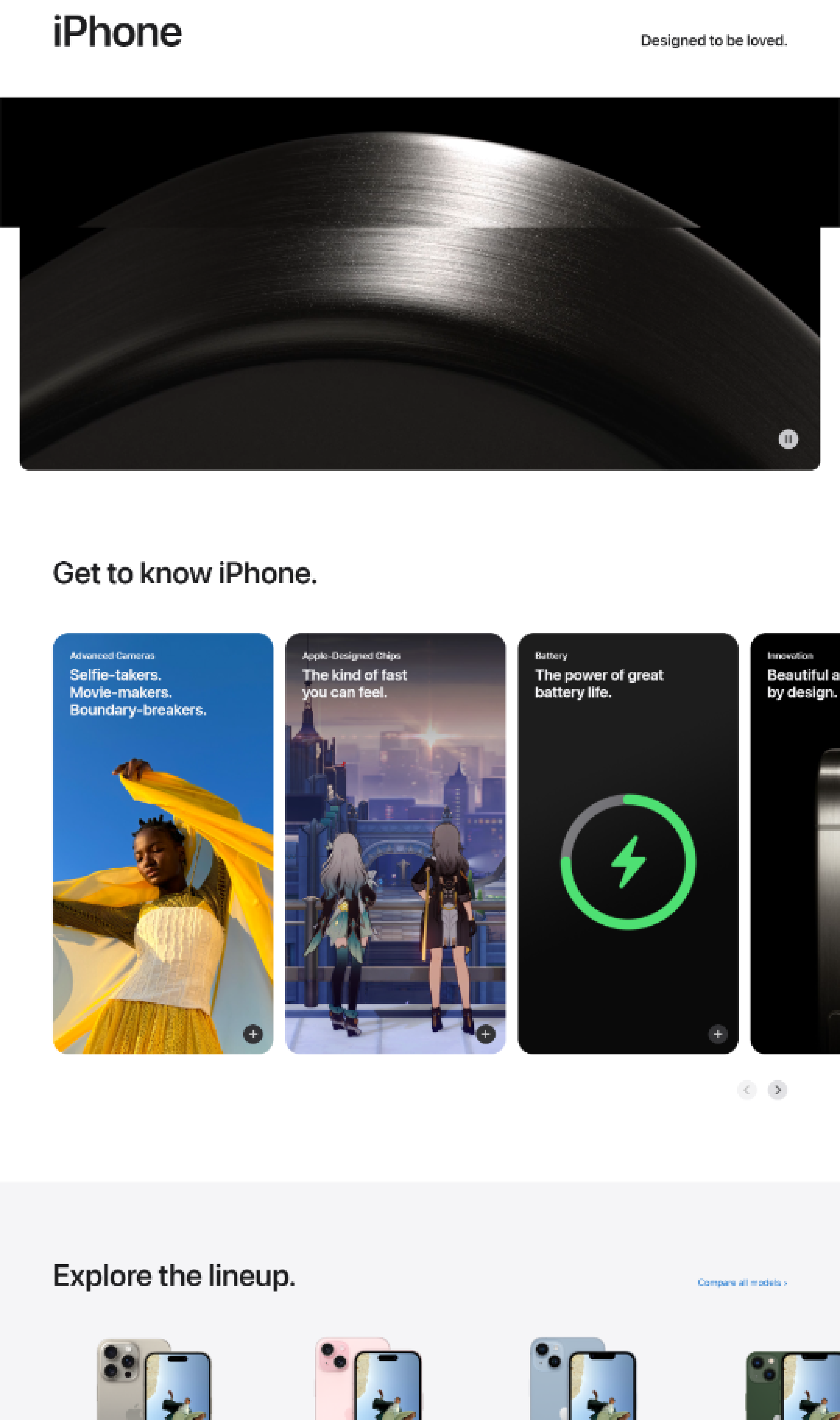
In the process of research we were led to discover the main friction and pain points of our user task. First and maybe the main one being prolonged scrolling. Another friction point can be the carousels that are used to introduce the users to the products Apple offers and the last one being the lack of Sorting option.
Based on the Task Analysis we concluded:
We found out that the main problem was the interaction cost in the face of long scrolling through oversized sections, animations and videos on different topics.
We believe that reducing the size and even removing or relocating certain sections can improve user’s experience and satisfaction with the website. We hope that this will potentially lead to higher conversion rate followed by increased revenue.
Based on the Usability Review we concluded:
Adding a simple feature such as a Sorting option can possibly be of help for Apple’s customers. Another inconvenience users face is the carousel in the website. Typically a good practice is considered to leave 3-4 items per row and adding another one. Having everything that we want users to see right before their eyes can be precious.
Stage 2
Hypotheses and Solutions
What we suggest:
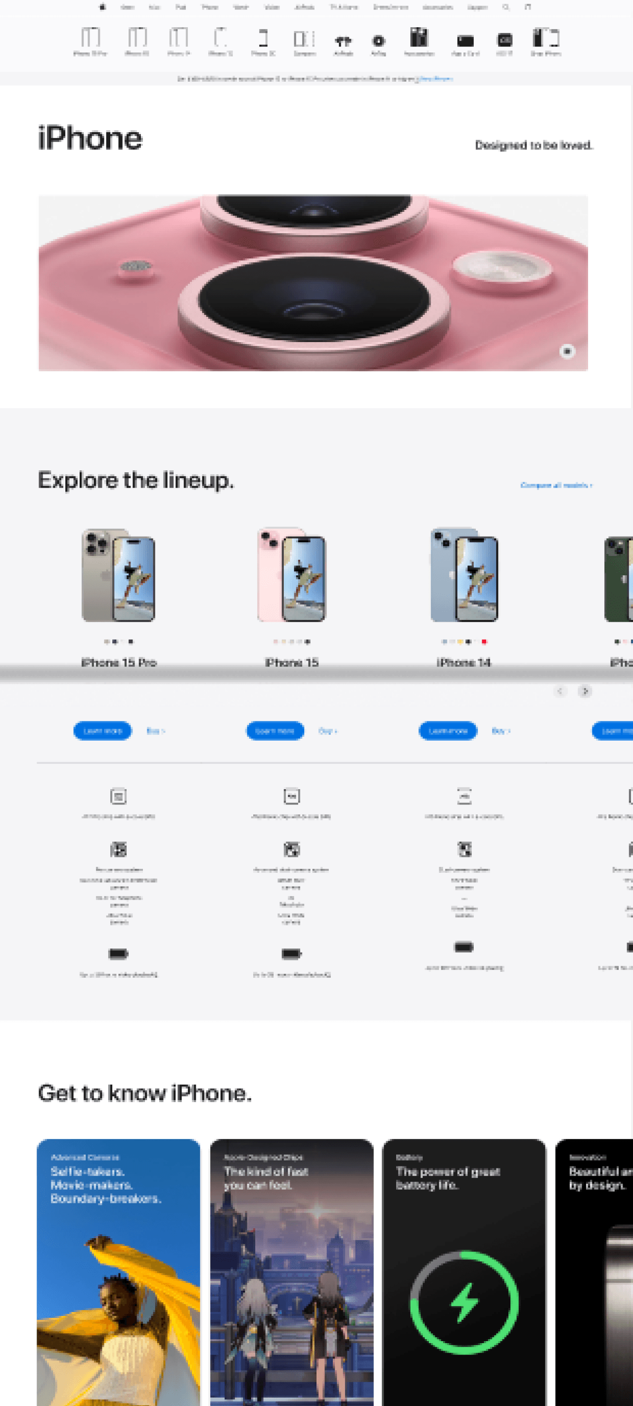
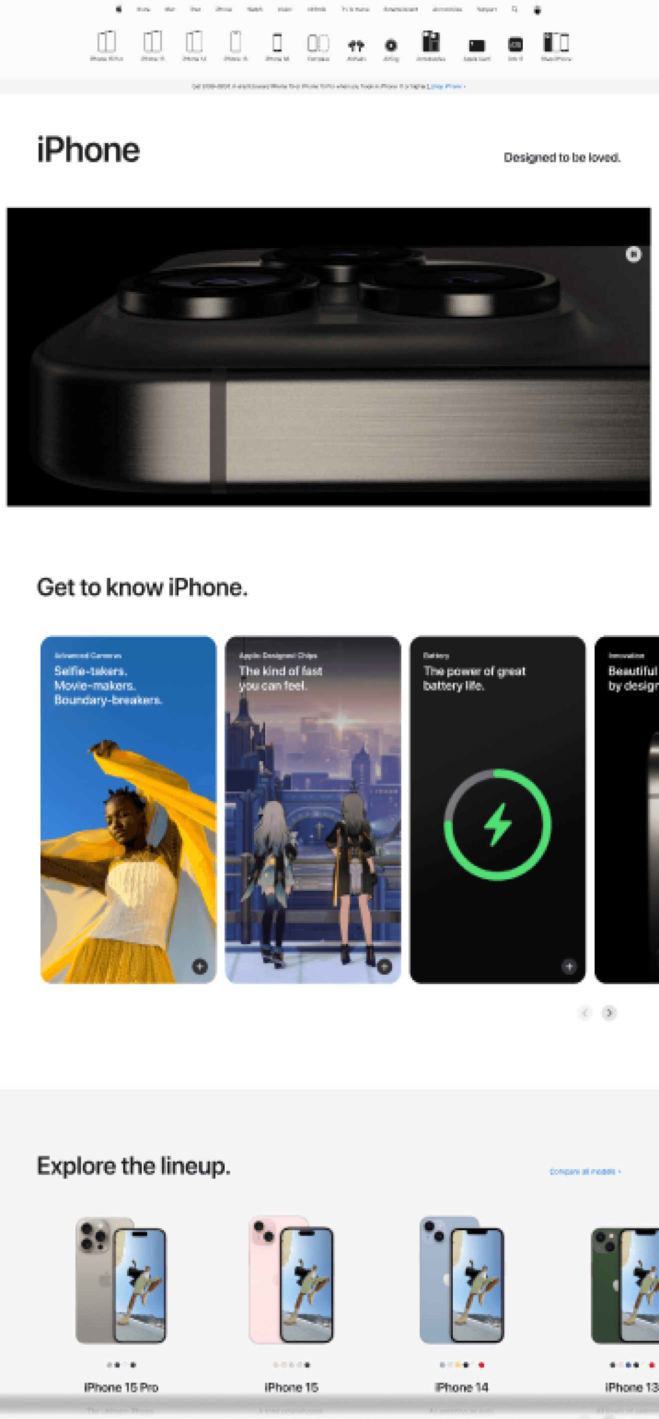
Before
As you can see there is long scrolling before getting to what you’re after, especially on your browser.
Before
As we mentioned earlier lack of Sorting options can lead to extra time spent wandering.
After
Here’s a quick UI solution.
After
To improve user experience we rearranged the sections. It is a minimal invasive method of assisting the user with his task.

Sort by
1.3
User Outcomes and Benefits
We believe that implementing our propositions, reducing some types of friction on crucial parts of the website as well as adding features such as a simple yet effective Sorting option can lead the user to:
Easily find information about features and specifications about different Apple products.
Spend less time scrolling through irrelevant and oversized sections in the website.
Enhanced user experience navigating the website.
Reduce interaction cost.
Making faster and easier choices choosing an Apple product.
1.2
Usability Expert Review
In the current project we conducted a Usability Review of Apple’s homepage and iPhone Store page which led us to some friction points. We looked into 33 practices which were categorized as “good”, “room to improve”, or “bad”.
You can find the whole Review here...
We believe that the current usability attributes are corresponding with the current state of the user task.
Satisfaction
Errors
Memorability
Efficiency
Learnability
9
11
10
8
1
Bad
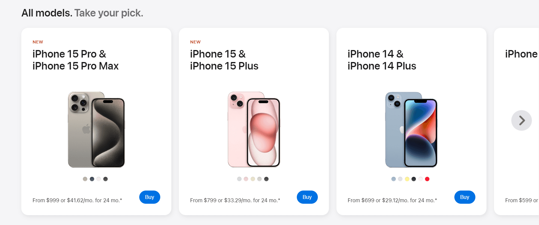
Users can not sort category page (e.g. ordering by price, "best-sellers", "new items", "most popular", or "most discounted")““
Add options for sorting/filtering on the indicated in the Store page. Or if not there straightaway, then we can add the sorting option after they have chosen what product to browse - e.g. iPhone.
Bad
No additional product photos are shown on mouse hover
Additional photos can help users to
see more of an item without the need to go to a different page thus saving the user some time and hopefully increase satisfaction.
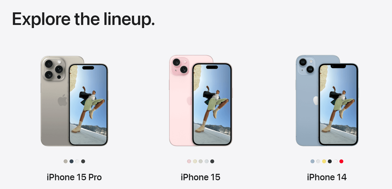
Room to Improve
There are more than (3-4) relevant products shown per row
Having 3-4 products per row is usually the way to go. The carousel here might confuse the user and could make them miss on some of the items listed. May be a better practice to add another row of items instead.
Room to Improve
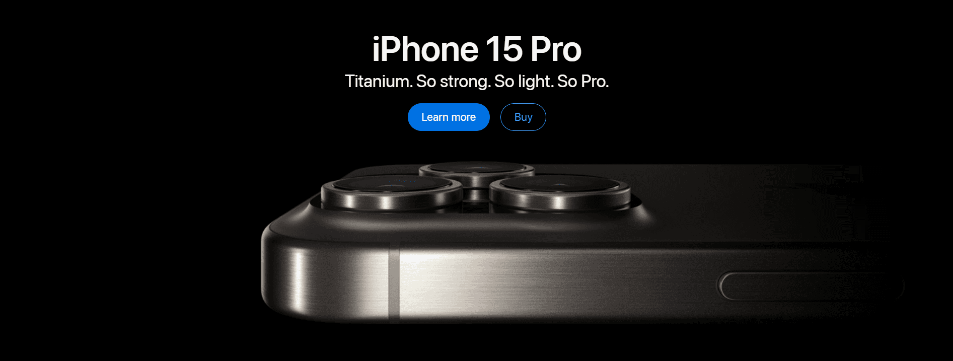
The main product photo does not allow a user to zoom in easily (especially on mobile)
The website itself doesn’t provide the option to open the picture and zoom in, what user could do is use the browser’s built-in zoom option. We do believe that Apple should provide the option to zoom on their future iPhone. The same applies for mobile too.
Good
There is a gallery with different product photos
There is a clear indication that there is a gallery with more pictures. We believe that they could provide even more pictures - someone holding the iPhone or how it looks placed on the desk just to give the user a real-life example how his phone would look.
Good
The product gallery supports swipe actions on mobile devices
Mobile version does support swipe function to switch between photos.
Based on the challenges met, we suggest:
Adding Store section in the homepage could improve user’s experience as the top navigation bar could easily go unnoticed/Make the top bar navigation bigger.
In the Store, in our case the “Shop iPhone” page, the products are presented in a carousel which may be confusing for some users with less experience in the digital world. Present 3 to 4 items per row and add more rows instead.
On desktop some sections of the website can be a little bigger than needed. This can also lead to confusion in users. We suggest making certain sections smaller so less scrolling is required to finish the task or perhaps consider relocating them.
4. When browsing the Store we can see that different color variations for certain item are shown under the image of it but they do not respond when clicked so they do not serve their full purpose. Our suggestion is to make them show the item in different colors as it is instinctively for the user to click on them.
2.1 Example:
3.1 Example
4.1 Example
Stage 1
What data we gathered and what research we conducted?
1.1
Task Analysis
In our case we analyzed a small task - comparing different models of iPhone. After further inspection we believe that the results of our Task Analysis can be applicable to the pages of other products as well.
The user's task was to find information on Apple’s Store about iPhones. Specifically, they had to obtain details about the characteristics and prices of the different iPhone models as well as do a comparison between them.
You can see the full diagram here...
In this case study
You will find the design process, research method, some hypotheses and potential solutions to the problem.
Upon analyzing
Upon analyzing the user task and conducting a Usability Expert Review on a section on Apple's website, it became evident that usually a straightforward process such as browsing different iPhones can turn troublesome and time-consuming for users.
With our project we aim to
Potentially improve conversion rates, customer satisfaction and retention which hopefully leads to increased revenue.
How do we do that?
Project Overview
and Design Process
Discover
Develop
Deliver
Define
PROBLEM
SOLUTION
Radoslav Milev
Usability Specialist
10.04.2024
Project Course
Softuni Creative, Design Advanced
Optimizing
Customer Experience
A case study on Apple's eCommerce Website
Using some UX Research techniques we conducted a short Review of Apple’s website.
We indicated some potentially harmful friction points as well as improvement propositions.
8-10 min read
Sofia, Bulgaria